25 Classic Fonts That Will Last a Whole Design Career
25 Classic Fonts That Will Last a Whole Design Career
Eric Gill, Adrian Frutiger and Max Miedinger are names we associate with the classic typefaces designers use on a daily basis. Their font creations are timeless designs that look right at home no matter what century we’re in. This collection of 25 classic fonts is a round-up of the best and most popular fonts every designer should own. You can be sure that they will last your whole design career.
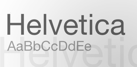
HELVETICA
Who hasn’t heard of Helvetica? It’s probably the most recognized classic typeface. Originally designed 1957 by Swiss designer Max Miedinger and Eduard Hoffmann
BODONI
Bodoni is a serif typeface designed by Giambattista Bodoni in 1798. Iconically used for the Goodfellas gangster movie poster.
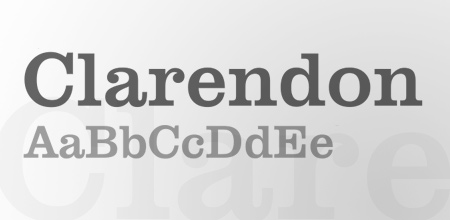
CLARENDON
Clarendon is a fantastically fat slab serif, created by Robert Besley in 1845.
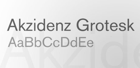
AKZIDENZ GROTESK
Akzidenz Grotesk was designed in 1896 by the H. Berthold AG type foundry and was used as inspiration in 1957 for the Helvetica typeface.
AVENIR
Avenir is a geometric sans-serif typeface designed by Adrian Frutiger (recall the name? He’s also famous for another classic font, I’ll let you guess which one).
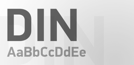
FF DIN
FF Din is a relatively new typeface compared to the veterans mentioned so far with it being created in 1995 by Albert-Jan Pool. One of my personal all-time favs.
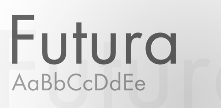
FUTURA
Futura is another widely used font that can be seen in countless logos. It was originally created in the 1920s by Paul Renner.
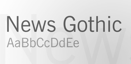
NEWS GOTHIC
News Gothic was designed by Morris Fuller Benton in 1908, and has the most amazing fact of being the typeface used during the Star Wars opening credits.
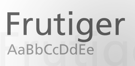
FRUTIGER
Remember Adrian Frutiger? Needless to say, he was also the designer behind the classic Frutiger typeface.
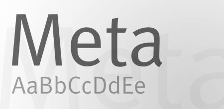
META
FF Meta is another member of the modern classic collection, designed by Erik Spiekermann in 1986. Meta is another of my personal favorites.
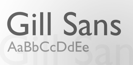
GILL SANS
Designed by Eric Gill in 1926, Gill Sans is another widely used font in graphic design. Famous users include the London Underground signage.
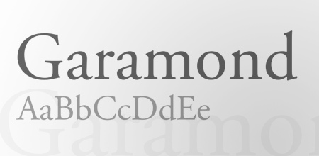
GARAMOND
Probably one of the most famous names for serif fonts, Garamond can be found in a number of variations. Overall it’s commonly used for body text in books.
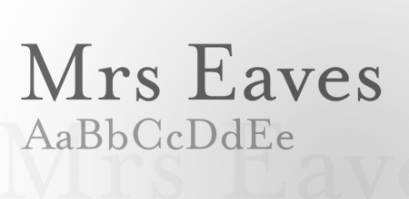
MRS EAVES
Mrs. Eaves is a recent design of a traditional serif typeface style by Zuzana Licko in 1996.
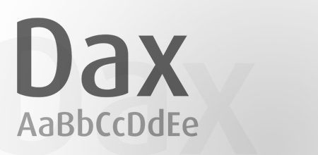
DAX
Dax, now famously used for the branding of UPS, was originally created by Hans Reichel.
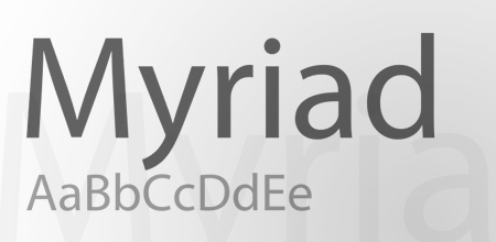
MYRIAD
Yes, that one that appears as default in your Adobe apps. Myriad was designed specifically for Adobe by Rober Slim back and Carol Twombly.
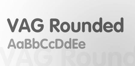
VAG ROUNDED
VAG Rounded, aka VAG Rundschrift, makes an appearance in countless web2.0 logos but was originally designed in 1979 as a corporate identity for Volkswagen.
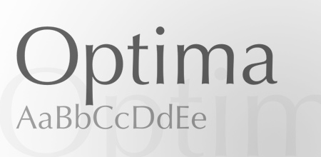
OPTIMA
Optima is a German typeface designed by Hermann Zapf. It’s a sans-serif font on a low-calorie diet with it’s thinning lines around the letterforms.
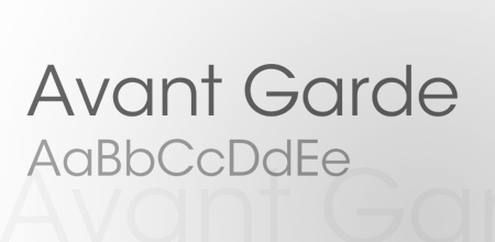
AVANT-GARDE
Originally created for the Avant-Garde Magazine, the Avant-Garde font is now seen in plenty of printed headlines.
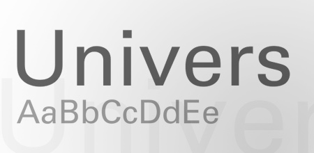
UNIVERS
Univers is another classic by Adrian Frutiger. It has typical swiss styling and is often confused with Helvetica or Akzidenz Grotesk.
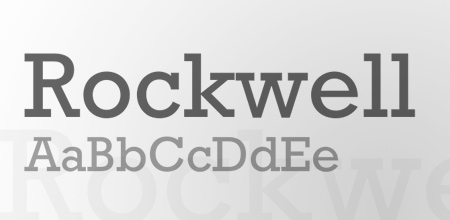
ROCKWELL
Rockwell is probably the most iconic slab-serif font. Designed by Monotype in 1934 it’s now used in all kinds of designs for an eye-grabbing impact.
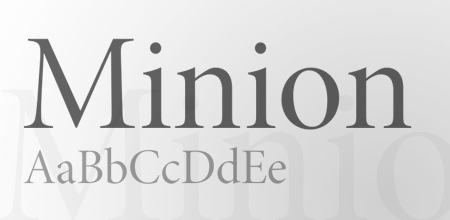
MINION
Minion is a popular serif font designed by Robert Slim back in 1990 for Adobe. Cleverly named after the traditional naming system for type sizes.
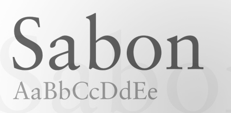
SABON
Sabon is another old-style serif, this one, however, was designed by Jan Tschichold in Germany and released by Linotype, Monotype, and Stempel in 1967.
COCON
Cocon is the most recent of this collection, designed in 1998 by Evert Bloemsma, Cocon features some cool letterforms with sleek points.
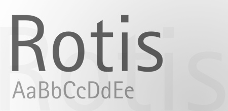
ROTIS
Rotis was built with exceptionally high legibility in mind. Designed by Otl Aicher in 1988.
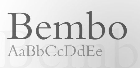
BEMBO
Bembo is one of the most popular typefaces used in books, first printed in 1496 and brought to life for the modern age in 1929.




Comments
Post a Comment